The Finer Points of Wine Labels
The eyes have it. As with books and covers, people judge a bottle by its looks and a poorly designed label can be detrimental to a wine’s success.
Winemakers obsess over every minuscule detail whilst they try and craft the perfect wine that expresses its terroir in grand fashion. But all that energy spent in the vineyard and cellar to arrive at a memorable bottle risks going to waste if the label design is not up to the mark.
Maybe that is why wineries demand nothing but the very best from graphic designers and expect them to make sure that the visual clues of the packaging tell a unique and captivating story everyone can connect with.
While some labels carry more artistic whimsy than any normal wine drinker could possibly want, others are exercises in minimalism. Getting it spot-on is no mean feat.
But regardless of design, each label of a bottle of wine that is made in Europe must provide the details that are required by EU law and the official protocols of its country of origin.
The intention is to help consumers make an informed choice about the contents and to protect them from fanciful claims.

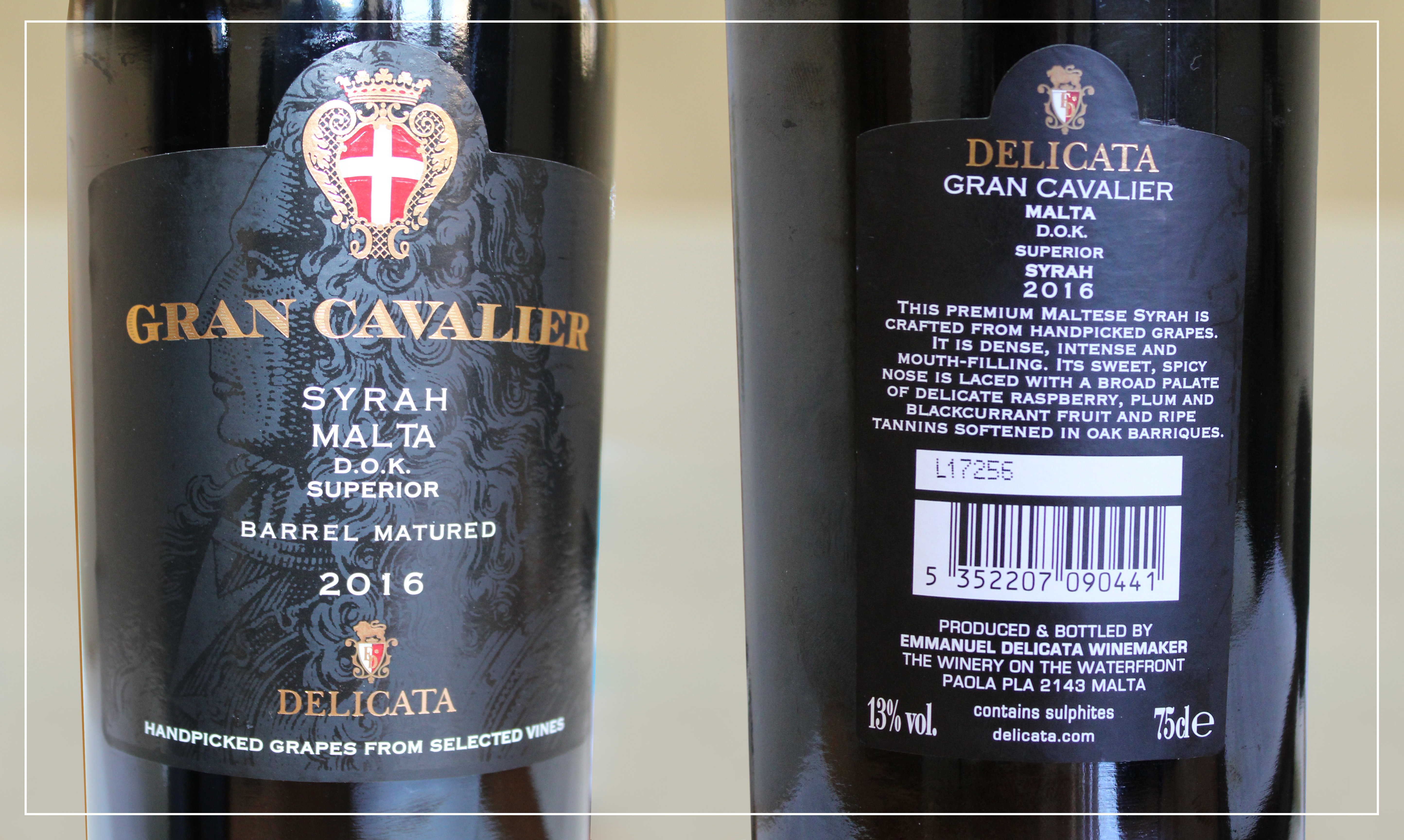
An example of a secondary (left) and main wine label (right)
For many years, wines were identified by their branded corks instead. However, nowadays it’s mandatory for every wine for sale to have a main label.
This isn’t necessarily the biggest paper glued to the bottle, as many assume. It usually isn’t the side of the bottle that catches the eye first.
From the standpoint of the regulatory authority – in Malta that’s the Parliamentary Secretariat for Agriculture, Fisheries & Animal Rights – the main label is the one that contains the required legal information. And, more often than not, that’s the sticker commonly referred to as the back label.
Let’s turn to an example, fine in taste and design: Delicata’s award-winning Gran Cavalier Syrah.
The larger, richly-treated paper (with the spot-varnished shimmer of a grand master in the back and the brand name and code of arms printed in gold-foil on top) is legally speaking just a spare label. In reality, the narrow one is the wine’s official passport.
The obligatory details for this big red wine are its country of origin and appellation (Malta D.O.K.), alcoholic strength (as a percentage of alcohol by volume), amount of wine in the bottle (expressed in centilitres), name and address of the producer (mentioned in clear fashion), the lot marking (an L followed by a coded date of bottling) and health-related details.
It may sound odd, but the brand name to remember the wine by (Gran Cavalier), the grape variety directly affecting its flavour (Syrah) as well as the vintage which is indicative of the bottle’s cellar potential (2016, when the grapes were picked) and the term superior (denoting a higher degree of alcohol) are actually no compulsory particulars but optional mentions. If used, as is the case here, they’re of course also subject to certain rules.
The tasting note describing the flavours the drinker may expect, the barcode and the winery’s website address are also completely supplemental.
And, so are those four letters you’d expect to see first. If you think it’s always mandatory to print the word ‘wine’ on a bottle’s label, think again. It isn’t.
This article by Georges Meekers was first published in the Times of Malta on 28/09/18.

